welcome
I’m Kelly Bittner, a Brand & Marketing Designer creating cohesive brand experiences and digital solutions, from websites and campaigns to full visual identities. I thrive on solving complex design challenges and translating ideas into polished, practical results.
I’ve partnered with organizations at every stage, from startups to global brands, combining strategy, design, and execution to deliver consistent, high-quality work.
I’m seeking full-time opportunities in the Twin Cities and want to connect with you. Let’s bring your brand to life!
I’m Kelly, a Brand Designer creating cohesive brand experiences and digital solutions. Let’s connect and bring your brand to life!






valley
role: Freelance Designer
- BRAND DEVELOPMENTDEV.
- BRAND IDENTITY
- ILLUSTRATION
- WEB DESIGN
- WEB DEVELOPMENTDEV.
- PRINT MARKETING
valley
BRANDING & IDENTITY
Valley Medical & Wellness was a new clinic specializing in pain management and addiction medicine, and our goal was toTo inspire patients facing a long recovery, we chose bright. Bright colors and custom illustrations were chosen, as stock photography wouldn’t convey the right tone. Cheerful characters enjoying everyday activities projected motivational messaging, and the logo's simple sunrise symbolized hope and renewal.
The resulting visual identity provided a consistent foundation, supporting the client’s growth from one location to four clinics.
valley
WEB DEVELOPMENT
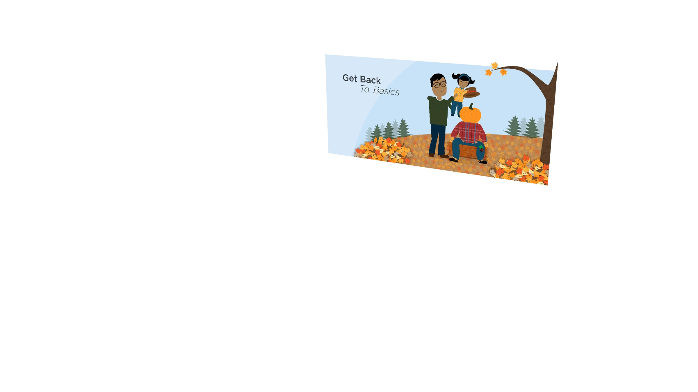
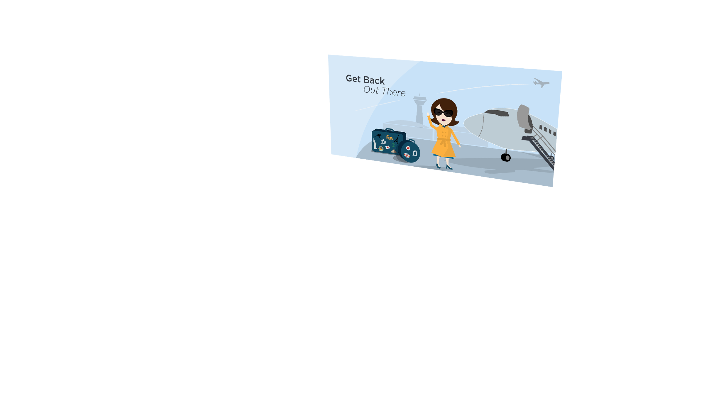
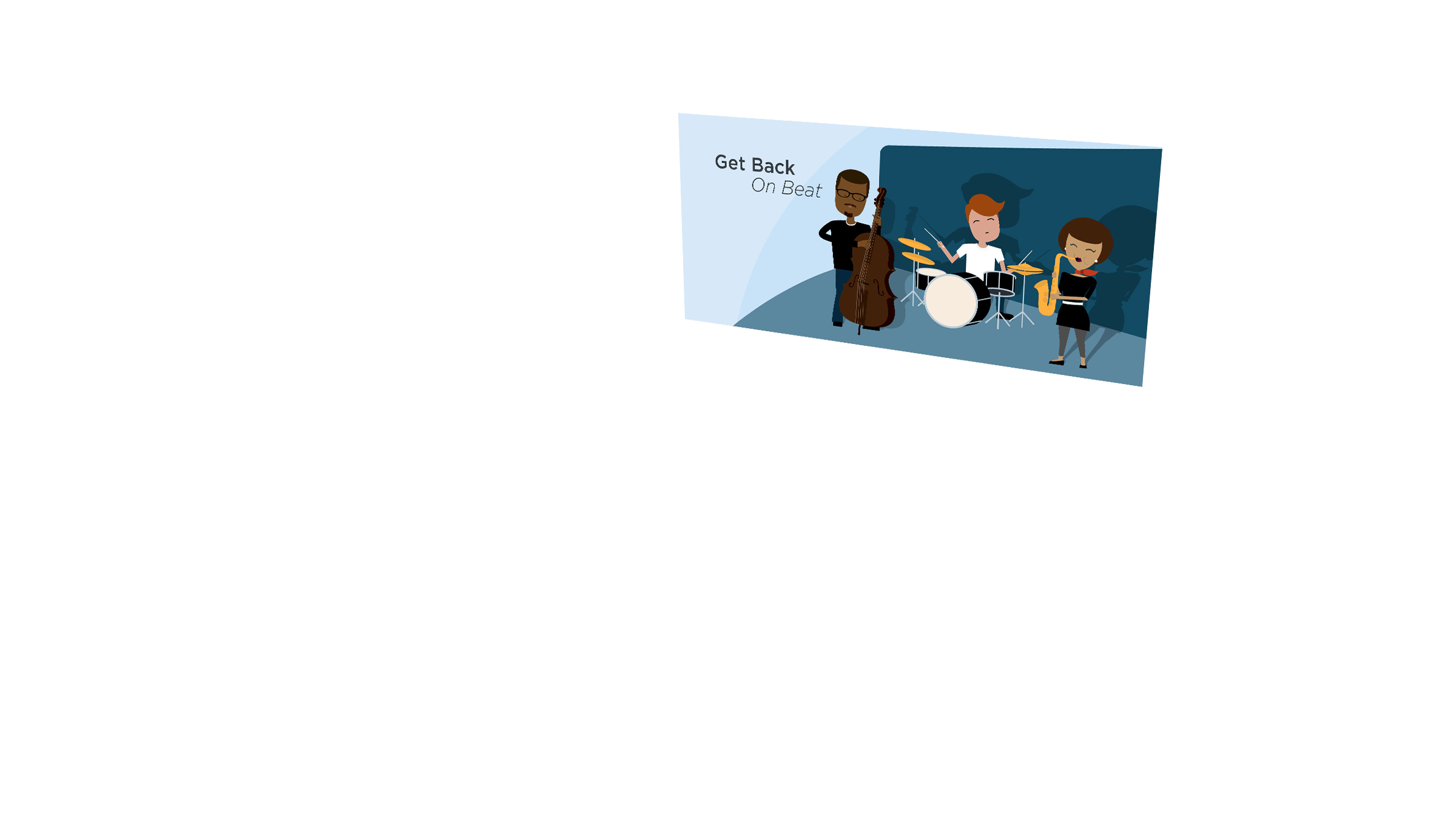
I co-developed a responsive Joomla site using a custom template, then provided updates and site management from 2014 through 2020. Key features included a newsfeed, chat interface, and multiple slideshows that rotated seasonally.

valley
WEB DESIGN
I designed a warm, inviting website with original icons and illustrations to engage and inspire patients managing pain and addiction. Seasonal slideshows showcased joyful characters in everyday activities, reinforcing positive messaging throughout the site.
valley
BUSINESS CARDS
Bright and memorable business card suite, including individual team member cards, generic office cards, and reverse-colored appointment cards, designed to distinguish functions while maintaining brand consistency.
valley
FLYERS
Marketing flyers featuring custom branded illustrations to promote seasonal specials and events. Produced for both print and online to maintain a consistent brand presence.
valley
TRIFOLD BROCHURE
Promotional brochure highlighting services, conditions treated, and an overview of the clinic. Brand-specific illustrations and graphics were used to visually communicate the medical approach and methodologies.
maria vera
role: Freelance Designer
- WEB & UI
- CLIENT INTAKE SYSTEM
- MARKETING COLLATERAL
maria vera
WEB & UI
Developed and launched a responsive Shopify website enabling online sales and service bookings that expanded revenue beyond in-office appointments. Clean layouts, intuitive navigation, and a calming visual language reflected the brand’s personalized, wellness-focused experience and improved usability.
maria vera
CLIENT INTAKE SYSTEM
To simplify workflow, I created and deployed a digital intake questionnaire that automatically generated standardized PDF files for each client. The system streamlined documentation, improved consistency, and reduced administrative time so the practitioner could focus on customer care.
maria vera
MARKETING COLLATERAL
A cohesive suite of branded marketing materials across print and digital, including postcards, gift cards, care guides, signage, and advertisements. Each piece supported promotions, retention, and in-office communication while maintaining a consistent visual identity.
smooth system
role: Freelance Designer
- BRAND IDENTITY
- WEB DESIGN:
B2C & B2B - PRINT MARKETING:
B2C & B2B
smooth system
BRAND IDENTITY
The Smooth System hair removal brand was designed to help clients feel confident and empowered in their own skin. Strong, sexy imagery representing new target demographics was combined with rich silver and gold tones and bold, succinct messaging to create a striking and modern identity.
smooth system
WEB DESIGN: B2C
The Smooth System website was structured to serve two audiences: direct consumers and business providers. The consumer-facing home page introduced the brand and explained product benefits and functionality, supported by a national directory to help customers locate treatment providers.
smooth system
WEB DESIGN: B2B
The B2B section of the site maintained consistent branding while addressing the needs of potential partners. It described key benefits such as reaching new clients and increasing revenue, and outlined available services, including training, marketing support, and onboarding.
smooth system
PRINT MARKETING: B2C & B2B
Promotional brochures were created for both audiences. The standard B2C trifold highlights the product’s unique benefits and functionality, with before-and-after photos. The square B2B trifold emphasizes the value for business partners, including target demographics and revenue potential.
ambiance
role: Freelance Designer
- LOGO DESIGN
- BRAND IDENTITY
- WEB DESIGN
- WEB DEVELOPMENT
ambiance
LOGO DESIGN
Ambiance Home Staging had built a strong reputation for beautifully staged homes, but their visual identity needed to better reflect the quality of their work. A custom “A” mark paired with clean typography created a modern, elegant feel, while a refined palette of rose gold and deep gray reinforced warmth and professionalism.
ambiance
BRAND IDENTITY
Building on the new logo and color palette, the brand identity was extended across stationery, business cards, and inventory hang tags to create a cohesive, professional system.
ambiance
WEB DESIGN
The newly branded color palette elevated this clean, intuitive website. Playful, approachable language highlighted the team and their award-winning work, while the star of the show was the professional photography of their staged homes.
ambiance
WEB DEVELOPMENT
The new site showcased a portfolio of staged homes and included an event reservation system for warehouse sales and VIP events, initially implemented to manage attendance during the pandemic. Built on a commercial WordPress theme, it was fully responsive and customized with HTML and CSS to refine layout and functionality while balancing budget and flexibility.
invites
role: Designer
- TYPOGRAPHY
- GRAPHIC DESIGN
- PRINT DESIGN
invites
WEDDING INVITATION SUITEGRAPHIC DESIGN
A smaller, more personal project, this custom wedding invitation suite blends formal elegance with playful detail. Decorative script and ornamental flourishes nod to the 19th-century Victorian venue, while mixed typography and a bright orange stripe add a sense of whimsy. The suite was letterpress printed and includes response postcards, handmade envelope liners, and tented table place cards.
invites
WEDDING INVITATION SUITEPRINT DESIGN
A smaller, more personal project, this custom wedding invitation suite blends formal elegance with playful detail. Decorative script and ornamental flourishes nod to the 19th-century Victorian venue, while mixed typography and a bright orange stripe add a sense of whimsy. The suite was letterpress printed and includes response postcards, handmade envelope liners, and tented table place cards.
invites
WEDDING INVITATION SUITETYPOGRAPHY
A smaller, more personal project, this custom wedding invitation suite blends formal elegance with playful detail. Decorative script and ornamental flourishes nod to the 19th-century Victorian venue, while mixed typography and a bright orange stripe add a sense of whimsy. The suite was letterpress printed and includes response postcards, handmade envelope liners, and tented table place cards.


